Food and Cooking! After a long, difficult decision (well it wasn't that difficult) I choose food and cooking. I do enjoy lifestyle magazines too, but I just didn't feel content with choosing it. I wanted to dive into a broad topic and really focus on that one, instead of skimming over a wide range of topics like lifestyle magazines normally do. Food and cooking magazines have always interested me and I have enjoyed them ever since I was little. In case you didn't realize by my last name, Miragliotta, I am Italian. I basically grew up cooking in the kitchen knowing how to cook al dente pasta before knowing how to add or subtract. We are all about savory, great tasting food that feeds the heart, and then the stomach, which is exactly the take I want for my magazine.
An influx of ideas are spewing out of my head on the angles I am aiming for. The main word I can use to describe my vision is decadence. I did not want to go the route of dieting or organic foods, like many food magazines are all about, because its just too mainstream, even though I do like the topics. I want my magazine to engage readers by featuring rich, savory food and ways they can make it without having a culinary degree, where they can go to eat it without spending their entire paycheck, and how they can eat it in moderation without feeling bad about it. One of my goals for my magazine is to hopefully rub off my passion for food and cooking onto my readers.
I have a vision of some of the essential components I would like to include onto my cover page. I definitely know I want my cover image to feature a decadent, mouthwatering dish that would make someone want to eat it right off the page. I want my image photographed in high key lighting, depicting the detailed features of the dish; I want to present it on either a dark wood background or simple white background.
For instance, here we have the representation of a dark wood background I am aspiring for...
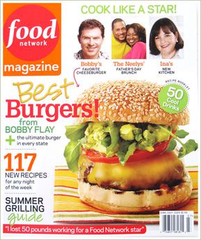
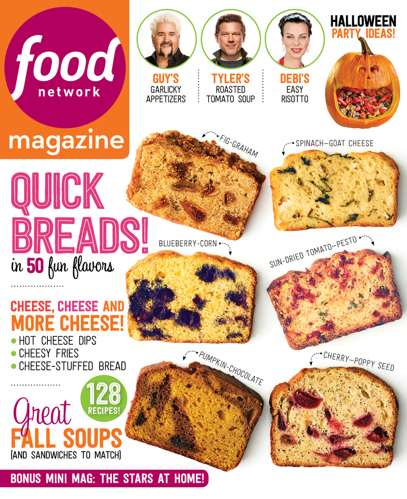
I carefully selected all four images due to the mutual similarities each one acquires. They all have a well balanced combination of decadence and cleanliness, which is exactly what I am going for. They all have small and minimal cover lines that allow that food to be the center of attention. I want my cover page to be elegant and classy as well as tasteful and simple. I am aiming for it to be clean and fresh, not crowded like some of the cooking magazines where you don't know which cover line to look at first. I am not fond of busy cover pages with a variety of bright bold colors everywhere because I find them to be overwhelming and messy. I typically am not a fan of The Food Network magazines because that is exactly what it usually looks like.
And yes, I understand the color psychology regarding food and appetite and to use reds and yellows, however, using bright, vibrant reds does not interest me at all because I feel like it is loud and obnoxious. Instead, I am going for more earthy, natural tones, rich in the deep colors of browns, reds, yellows, and greens. Now, I have to dive even deeper into my research to decide on my target audience and the stylistic elements that fits within my specific genre.
Until next time!


No comments:
Post a Comment