The other two portions of this project include creating a Film Poster and a Website for our film. Since me and Asher are working on this together and trust each other's opinions, we decided to split the minor tasks. We figured that working with our strong suits and deciphering who has stronger skills in certain areas, it is a good idea we take on different tasks.
Asher calls me a photoshop Goddess and many people have told me they think my work is pretty amazing, I try to stay humble about it, but the truth is I am really good at creating and editing graphic designs. I have always loved creating things and it has become quite a hobby of mine in the last few years. I discovered this online software called Canva in my freshman year, and it has become one of my most valuable tools in my high school career, especially in AICE Media Studies. I really love using this site because first of all, it's free, and second of all they give me so many options and choices I can choose from. So with that being said, I have taken on the film poster task.
For starters I like to come up with my color scheme to use. I wanted to use natural earth tones because I wanted to capture the essence of our film and since these colors went well with many of our scenes, I chose to do them.
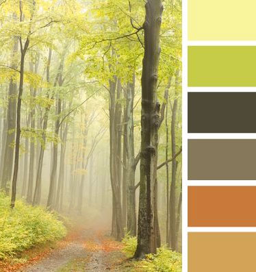
I made certain colors richer than others, and lightened up some of the tones. Color is very important to a film poster and cover and while some many not think so, there are many psychological drives that come with choosing color schemes. I also incorporated some blues into the film poster, since that is also considered an Earth tone but is just not shown on this palate.
Here is an infographic I found very useful in creating the film poster:

I found this very helpful in directing my mindset and staying on track to always focus on the mood of our film. For instance, the green of course signifies nature, but it also portrays feelings of darkness and danger. Blue represents feeling of isolation and melancholiness; tones of yellow shows madness, sickness, and insecurity. These colors all played a part in the film poster, whether or not it was the exact colors, or tones of it, they all integrated mixed feeling to set the goal of one overall mood.
Another trend I noticed when researching film posters for dramas was the technique of using transparency in the upper half of the poster. For instance:


I will be incorporating transparent elements into the film poster and it is going to signify many of the issues in our film.
I had to be wise about choosing colors because I was cautious about how they will appear throughout different platforms. For example, for our film to be marketing in movie theaters, I need to design it to stand out an to pop out at people as they walk past to go to see their movie. So after researching, movie theaters are often very dark; they either have dark purple walls, red, and even sometimes black. I suppose they have a stereotypical ambiance they want to follow which is good for film graphic designers because then they know which colors to choose. I figured my color scheme will contrast the darkness and go great with whichever the movie theater theme is. They also usually present the film poster in a white or black frame, so these colors will go just fine, since they are mostly natural earth based tones. I also want to market with one of those huge cardboard cutouts that are shown inside of movie theaters and in film festivals so that it literally pops out at people. Again, these color schemes are easy to manipulate to go with anything!
I am so eager to show you all the film poster I have created, but to keep that element of surprise, I am going to hold off a little while longer on showing it to to all of you.
Until next time!
No comments:
Post a Comment