Sunday, April 10, 2016
Thursday, April 7, 2016
Almost Finished!
Hi everyone! I am really excited to say that I am almost finished! My double page spread is really coming together nicely. I am planning on taking a drive over to Miami to capture some really great pictures of the Miami skyline towards the afternoon/evening. I would really like to try to have both pictures of the scene during the day and the night when it is all lit up because I want to give myself the option of using both. I will insert the picture at the end, and continue to work on my story. It is coming along very well, I want to go to each of these restaurants and eat their dishes! I am going to change the part where I want to include a signature drink for each place because some of the restaurants do not have special drinks from their country. Instead, I am going include an appetizer, a main entrée, and a dessert. My article is fitting in with my theme of decadence and indulgence beautifully because the restaurants are just that.
 |
| Italy: Il Gabbiano |
 |
| Japan: Zuma |
 |
| Greece: Mandolin Aegean Bistro |
 |
| Cuba: Larios on the Beach |
I am extremely eager to finally show you my magazine! I will be posting my final product on Sunday and I hope you all will leave comments letting me know what you think! I showed a few more of my classmates my pages today and they were blow away. It is such a good feeling knowing you created something really special. I feel like I achieved one of my goals of "wowing" my peers. Their expressions and reactions are worth hard work and effort I have put into every single detail. As well as my final product, I will also be posting a creative critical reflection (the third part of my project) on Sunday so you all can see my thought process and my reflection on this amazing journey of creating a magazine!
Keep in touch!
|
Wednesday, April 6, 2016
Just a Little More Research
Hello everyone! Today I have been continuing research on each of my restaurants, looking up their top dishes, their reviews, and their traditions. I will incorporate all of these aspects into my article for each restaurant. I would like to include a description for each restaurant, why my audience should go there and, food wise, I want to exhibit the best entrée, drink, and dessert that represents each country the best. Even though it would be extremely ideal to have a photo of each item from each restaurant, it is just not feasible. I would also like to go out and get a picture of each restaurant, but that doesn't seem too practical for me right now either. However, what I can do, and what I want to do, is take a photo of the miami skyline and use this one picture for the background of my two page spread. This photo would symbolize Miami as a whole and how it is a pretty small city that has the world inside of it.
I am aiming to capture a photo similar to this one:
 |
| Miami Skyline |
I think this is the best way to incorporate visuals for this part of my production because it gives my audience a broader view of Miami and it would represent each restaurant inside of the city. I am really hoping I get to capture a photo as good as this one that I am visualizing in my head, but if not I will come up with a plan B.
Stay tuned readers!
Tuesday, April 5, 2016
Two Page Spread Changes
I also have changed the idea of categorizing my article by restaurants in different continents, instead I will go by country and the style of food. It makes more sense this way because I the style of food is more prominent than the continent it is from. For instance, I was not going to include the United States under North America, nor was I planning on using Canada or Mexico, because to me those aren't "World-Traveler" enough. While on the other side of this, we have Europe that has a handful of countries with excellent pallets, as well as Asia. This categorizing system by continent was just not uniform or symmetrical. Now I will group the restaurants by country and have two restaurants under each category. Below is my drafted list of my proposed restaurants and countries:
- Italian: Il Gabbiano and Macaluso's
- French: db Bistro Moderne and Cafe Bastille
- Greek: Mandolin Aegean Bistro and Pega Grill
- Columbian: La Moon Restaurant and Monserrate Restaurant Miami
- Brazilian: Fogo de Chão Brazilian Steakhouse and Boteco
- Peruvian: CVI.CHE 105 and Limon & Sabor
- Argentinian: La Patagonia Argentina Restaurant and Fiorito
- Japanese: Sushi Siam and Zuma
- Vietnamese: Miss Saigon and Miss Saigon Bistro
- Indian: Bombay Darbar and Thali Indian Cuisine
- Cuban: Versailles and Larios on the Beach
- Caribbean: Clive's Cafe and Tap Tap Restaurant
After searching through the hundreds of international restaurants in Miami, I carefully selected two from the highest ranked style of foods people tend to eat the most. I tried choosing one restaurant that was more on the fancy side and one that was either a Café or a Mom and Pop restaurant. I wanted to go with both to give my readers an option and a happy medium depending on where they want to go and how much they want to spend. I am super excited to go more in depth on these restaurants and finish my two page spread!
Au Revoir!
Saturday, April 2, 2016
More Brainstorming
Hello everyone! So today I researched more for my two page spread. I decided that I want to separate and categorize my two page spread by the 7 continents and discuss around 2-3 restaurants for each continent. I will explain how each restaurant brings something different to the table (literally and metaphorically) by picking out the best dishes and talking about the traditions they take part in according to which country they belong to. I would really like to go to each restaurant I choose after I conduct more to do interviews and to take pictures of either the scenery or the food.


As for the layout, I would like to use a really cool layout for the title page because I love the look of having a full page for the title. For the rest of the pages, I would like to use either 2 or 3 columns per page for the content of the restaurants. I am very interested in designs like these two layouts:
I am still going to need to research more restaurants and then I will start on my two page spread. As for an update on the rest of my magazine, I have continued to edit my cover page and put the rest of my cover lines. I am going to feature the table of contents that I have created for my project, but my table of contents for my full magazine is going to be about 6 pages.
For now I am going to finish coming up with ideas for my two page spread and start writing my article, I'm so excited!
Friday, April 1, 2016
Two Page Spread Decisions...
So my main focus these days have all been about my two page spread for my magazine. I'm not sure what the issue is, but I am having trouble finding inspiration that really makes me go, "WOW" like my cover page and table of contents pages did. I am not stuck on the content of what I am going to write about because I have ideas in mind of a basis of what my article is going to be about. I want to write my article on, as I mentioned in my previous post, I want to write my spread on "How to Eat Like a War Traveler- in Miami." I chose to write about Miami instead of Fort Lauderdale for several reasons. After researching both cities, Miami was much more popular than Fort Lauderdale and it has a much larger variety of international restaurants. Miami is one of the most famous cities to travel to in America, so by including it, a majority of my readers will be familiarized with it, that is of course if they are not already local. I think that I can really do a lot with this story and can go in multiple directions for it.
However, even though I have a pretty clear understanding of my story, my troubles lie in the hands of the layout and the design. I understand that I will write the story and pick out visuals first, but I enjoy knowing beforehand how I am going to create my layout. I really like working with different designs that catch the eye, so I am really trying hard to find some that interest me in doing so.
I am not going to get discouraged because I know that I will find something and make something that I know I will love and my readers will love. I am really excited to write this story because Miami has every restaurant ethnicity you could imagine! I am thinking of categorizing my story either by the Continents, or by famous cities. Still undecided because I have to find more about the roots of each restaurant that I am interested in including in my spread. But the best part about all of these restaurants is that they maintain and capture my theme of savory and decadent food, as well as having the international flare I am looking for. Also, it is great that the majority of these restaurants have a copyright free menu posted online, so I don't have to worry about asking for permission to include some of their meals. As for now, I will continue to research and explore plausible restaurants and layouts to utilize for my article.
Keep posted everyone!
Citations:
International Cuisine. (n.d.). Retrieved April 01, 2016, from http://www.miamiandbeaches.com/things-to-do/dining/international-cuisine
Why Miami is One of the Best Cities in America for Travel. (n.d.). Retrieved April 01, 2016, from http://www.aroundtheworldl.com/2011/07/10/why-miami-is-one-of-the-best-cities-in-america-for-travel/
Thursday, March 31, 2016
Cover Page!
I'm so excited to say that I have finally made my cover page!!! I feel as if I captured exactly what I was aiming for; the richness, the decadence, the dark wood, the high key lighting on the food, minimal cover lines... I am extremely happy with the outcome and proud of the results. I showed my AICE Media Studies teacher, Ms. Stoklosa, and she seemed to be very pleased with the results, as well, which made me 100 times happier. Not only did she see, but she showed some of my classmates because she wanted them to see how amazing it turned out, and to my surprise they were all really impressed with my work and they were so supportive! Showing them my cover page was the confidence I needed for the continuation of my project! I can't wait for you all to see my finished products, which I will post when I completely finish everything!
As I met with my teacher I discussed with her possible ideas for my two page spread. This was the only aspect of my project I was stumped on because I wasn't sure what the best route for me to take would be. I was going in between making an article about recipes or restaurants that have a similar style as my magazine. When I proposed my ideas and my cover lines to Ms. Stoklosa, we mutually agreed that it would be interesting if I did the article "How to Eat Like a World Traveler- At Home." After pondering on the idea, I tweaked the story a little bit and thought about "How to Eat Like a World Traveler- Locally" (which would mean either in Miami or Fort Lauderdale). I thought it would be really neat if I traveled to international styled restaurants or with different nationalities and researched their menus or interviewed some of the employees. I still have not made a finally decision as to which one I will continue my story one, but either one I choose I know will turn out to be amazing and I'm excited!
Check back soon to see which two page spread I choose!
Saturday, March 26, 2016
Editing in progress...
I am currently in the process of the continuation of my editing, so I do not have a final product just yet. I am a perfectionist, and sometimes that is a weakness of mine since I want every little detail to be perfect. Editing graphics takes a while if you know what you're doing and if you're doing it right. I love creating graphics and I always want to try something new and make something different, which is what takes longs because I create all possible options before settling with just one. I am overly enjoying creating these pieces, to the point where I don't want to do anything else. It's all I think about. If I'm not editing on my pages on the computer, I'm on Pinterest searching more ideas.
So with that being said, I am going to continue meticulously edit my pages until they are absolutely ready.
Ciao!
Ciao!
Friday, March 25, 2016
Table Of Contents Inspiration!
YAYYY! Today I took a really great photo for the background of my table of contents pages and I'm so excited to show you all my results, but you'll have to wait because I'm not quite finished yet!
Citations:
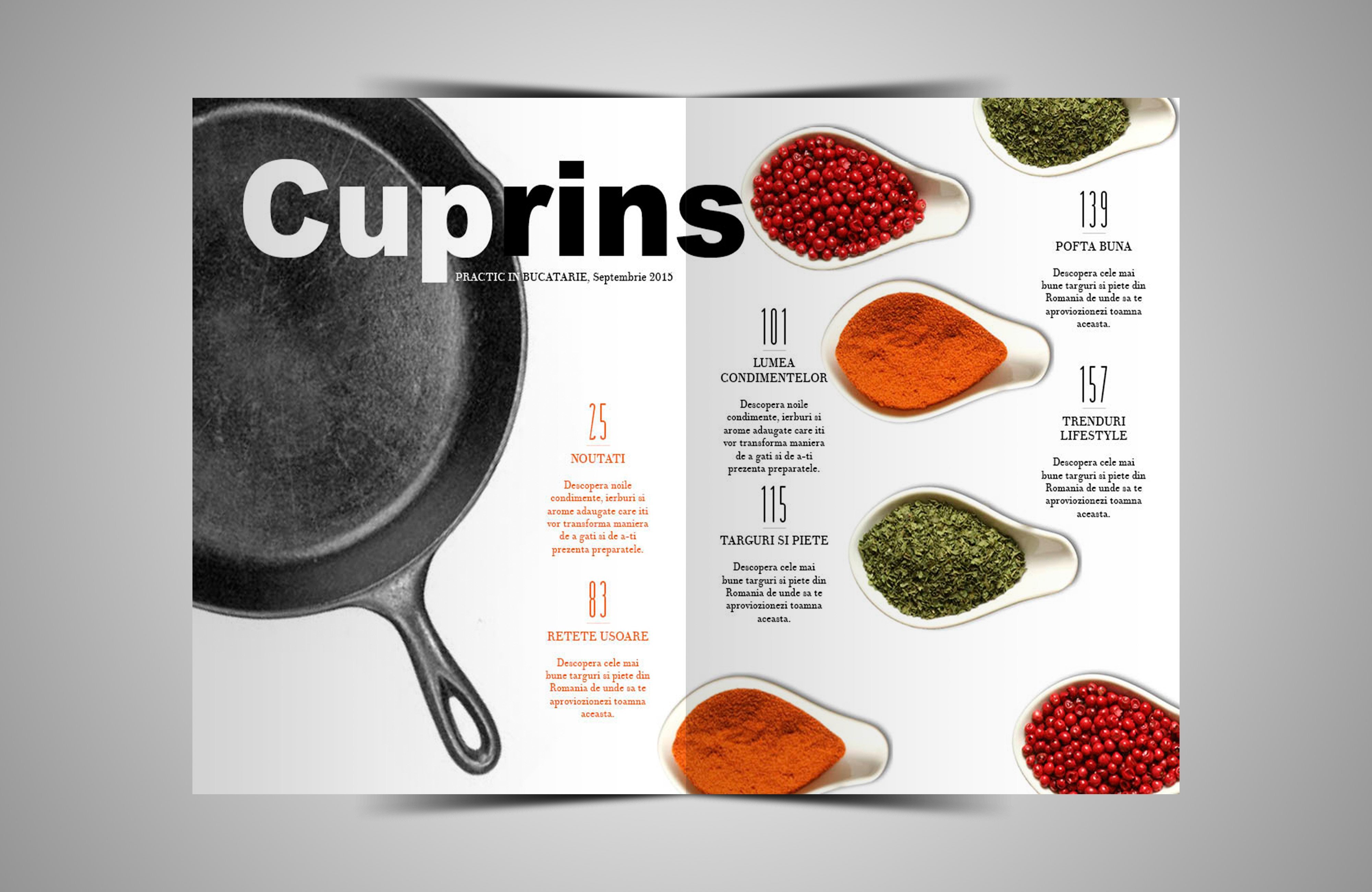
In my previous posts I discussed how I would like to rearrange ingredients or food components on a white background and take it from a high angle; however, I had a vision in my head that I could not seem to sketch out on paper or find inspiration on the internet. The four photos I posted before to show as an example for the table of contents had several components that could work, but none of them had what I was looking for. I still want to maintain the level of cleanliness and classiness, so scattered ingredients all over the page seemed messy to me and I didn't want it to look cluttered. As I was searching, I grew a larger dislike for the same appearances over and over again, but I am so glad I kept on looking. Through all the history of my searches, clicking link after link, I finally found what I have been looking for. I found the inspiration I needed. Clean, simple, elegant, yet exploiting all of the other components I want: the white background, the aerial view of ingredients, the colors. Its just perfect:
 |
| Adobe InDesign Tutorial Photo
I searched this image separately in Google and I found out that this image was created for a tutorial of how to design creative table of contents pages for fictional cooking magazine by Adobe InDesign. I would have never guessed this photo wasn't for a professional cooking magazine. Down below in the comments of this webpage was a viewer sharing how she created her very own table of contents for a local magazine with the help of this Abode InDesign photo. After seeing hers, it put me over the edge and I knew I had to create my image similar to these, putting my own twist on it.
|
 |
| Random Lady's creation Table Of Contents |
I was so happy to find these images because now I can finally create a huge part of my magazine. I was actually considering buying Adobe InDesign just so I can create this image, but I realized I didn't need it. With the help of the two amazing sites, Pixlr Editor and Joomag, I am going to continue on making my very own table of contents.
This morning was much better weather for my photo, so hurray for that, and I started editing my photo on its way to perfection. I'm beyond excited to finish and show you all my final product!
Enjoy looking at these before photos, but stay tuned to see more of the finished product tomorrow!
 |
| Photo I took this morning |
 |
| Pixrl Editor |
Citations:
How to Design a Cool Contents Page in Adobe InDesign - Envato Tuts Design & Illustration Tutorial. (n.d.). Retrieved March 25, 2016, from http://design.tutsplus.com/tutorials/how-to-design-a-cool-contents-page-in-adobe-indesign--cms-24373
Thursday, March 24, 2016
Practice Makes Perfect...
So lately I have been focusing on the pictures for Decadence. It turns out, it is a lot harder than it looks to get a savory dish to look savory in a photo. I went through some ups and downs trying to get some great photos, and after getting frustrated, I realized that I just need to practice and take numerous photos at a time during the day. Today I took a few photos of what my mom made for breakfast and I was very pleased with how they came out. I'm not sure how I'm going to incorporate these photos into my magazine but I'm taking them just in case I want to use them. However, I have learned more about picture-taking through this experience than through any research I have done. I learned that many props, the time of day, the quality of the camera and the food all go hand in hand in creating a great photo.
Today, I made the mistake of trying to take my table of contents photos after it rained. I know how important it is to take a photo in natural lighting because, trust me, it makes a huge difference. But who knew the weather could impact my project so much! I read somewhere that overcast days are the best days to take pictures. Yeah right, it's the worst! The overcast weather made my photos come out dull and lifeless, with unnecessary shadows. I was very annoyed at how it came out because it took me a while to set up all my ingredients and white foam boards, but it's alright, now I know that I have to take my photos when it is sunny outside.
 Tomorrow I am going to practice and take my photos once again during the morning. But for now, I am going to practice editing my photos and you can enjoy this photo I took of my breakfast this morning!
Saturday, March 19, 2016
Photography Tips
Since I am only allowed to use original photos taken by me, I decided to look up the do's and dont's of food photography. Turns out, it's not as easy as it looks. In fact, in order to capture a great image, there is many tips the photographer should follow. Lighting is extremely important. Use natural lighting at all costs, preferably near a window. This lighting is much less harsh on the food than using flash from a camera; artificial lighting calls for unappetizing shots. If the natural lighting is so bright, tone it down by covering the window with a white sheet or white tablecloth. Use a backdrop behind the food, and under the food, to avoid distractions or other lighting that can interfere with the photo. White and black cardboard boards are common, as well as wooden cutting boards. A still image is also a necessity. Set up the camera on a tripod, table, or chair, but not moving is essential to avoiding a blurry image.
Those are some of the most important tips I gathered on the internet, as well as from accumulating the information from images I searched on Pinterest.


Write to you all soon!
Citations:
Food Photography: How to Take Mouth Watering Shots of Food. (2011). Retrieved March 19, 2016, from http://digital-photography-school.com/food-photography-an-introduction/
The Ten Tastiest Food Photography Tips. (n.d.). Retrieved March 19, 2016, from http://content.photojojo.com/photo-technique/tips/food-photography-tips/
Friday, March 18, 2016
Woohoo! I finally know what I shall title my magazine! After brainstorming savory food words, I came down to two options: indulgence and decadence. I wanted to capture the essence of my theme through my title, so what's better then blatantly telling my audience to take pleasure in eating rich, savory, flavorful food. I chose Decadence as my final title because I think it represents the luxurious, classy, and enjoyable food perfectly, rather than indulgence which, to me, makes it sound as if I want my audience to indulge in everything they ate, and that's not the case. I want them to "Feed the Soul" (which is what I made my selling line).

I worked on a rough sketch for my proposed vision for Decadence. I know now that I am definitely going to use a dark wood background for my cover page because it resembles more of my style and my magazine's style. I know I'm not the best drawer, so please don't judge my pasta dish. Anyways, I am really considering making my cover image a pasta dish with a fork twirling some of it around. I think this will add dimension to my cover page, while giving it an element of comfort. When my audience sees the dish ready to be eaten, they will know that this food is meant to eaten, not just to look at, and enjoyed with passion, appealing to their senses and appetite. The cover lines are simply just sketches; I may use what I wrote, I may add to them, or I may disregard them completely and create new ones. I don't know. I just wanted to give you viewers a chance to see a piece of my vision first hand.
I am choosing to use pasta for several reasons:
1. Because I like pasta,
2. Because my family has amazing pasta recipes,
3. Because it's easy to maneuver and plate for the photograph,
4. Because it maintains the level of elegance and class,
and 5. Because I am able to work around it to create any color scheme I want.
Now that I have a set image to go by and create digitally, I moved on to discovering what I would like to do with my table of contents. After looking at various options of how I can layout my table of contents, I am stuck on a set image in my mind that I want to recreate. And yes, I am very picky with all elements of my magazine because I know what I want and I'm going to do just that.
I want one image, displayed over two pages of table of contents, that is an aerial of either ingredients or food components. I prefer these pages to have a white background to contrast with my cover page and so it has open space, making my content seem shorter and easier to read, but many of the examples I found do not have all of these elements combined into one page. For instance, I want to incorporate many of the components of these examples into my page:


Even though all of these layouts appeal to me, I need to adjust them so they can fit the look and theme of my magazine. I still need to think about all of the logistics first, then I will get back to you all once I know what my imagination come up with next!
Adiós!
Thursday, March 17, 2016
Inspirations
When I think of my magazine, two specific magazines come to mind:
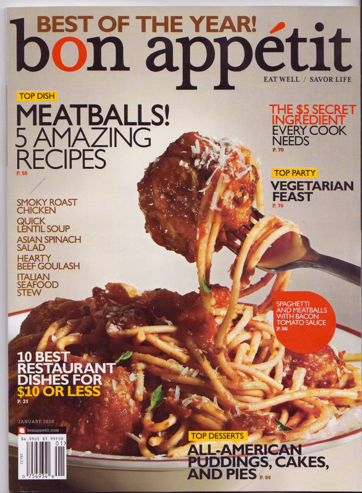
Bon Appétit and Food and Wine. At first, I only aspired for my magazine to have the same values Bon Appétit, but after looking more in depth into several magazines, I realized that I want similar characteristics for my magazine as Food and Wine has. However, I draw major inspiration from them they both share a similar passion for food as I do. There magazine embodies the outlook and captures the image of what I am aiming to produce. They both feature many hearty meals to make at home, yet they both contain the level of elegance and class that I am looking for. I really love how they both have a nice balance of family oriented food, culture, and lifestyle all revolving around one aspect: their love and passion for food.
Bon Appétit was founded in 1955, and they have majorly grown since then. Their latest mission statement reads:
“Food choices that celebrate flavor, affirm regional cultural traditions and support local communities without compromising air, water or soil now and in the future.”Fedele Bauccio, the founder of Bon Appétit Management Co., has the same goal I do for a cooking magazine: celebrating food. His whole mantra revolves around flavor, but after learning more about him, he is all about appreciating the sustainability of food. Now, I understand how important it is to endure biological and ecological systems and to be environmentally friendly and, yes, I agree with him to a certain degree; however, I'm really not interested in it for my magazine because it's not what I'm aiming for. I did not like founding this out because at that moment I felt like I was following the wrong path. So, after finding this out, I also found out that they are changing their mission statement and I was really not to happy about it, but it's okay, I'm moving on from them.
This is their proposed mission statement:
Yeah, see what I mean? Not my style, sorry."A sustainable future for food service means flavorful food that’s healthy and economically viable for all, produced through practices that respect farmers, workers, and animals; nourish the community; and replenish our shared natural resources for future generations."
But then, Food and Wine came and saved me from my short-termed misery. I came across their mission statement, which is quite lengthy, but I liked it so much better then the previous ones mentioned above.
"FOOD & WINE is the ultimate authority on the best of what's new in food, drink, travel, design and entertaining. The epicurean mind-set translates into a passion for life, and as the ultimate authority, FOOD & WINE gives you access to the food and wine world like no other brand. We reach the ultimate epicurean - your best customer - and create unique experiences and emotional connections between these influential consumers and your brand that inspire engagement and transaction."Ahhh... much better. The founders Michael and Ariane Batterberry, and the happy couple, want to express the history of food and culture by reaching their audience on another level. They want to create deeper connections with their audience, to both men and women, as do I.
We share a very similar target audience:
- Family oriented women and men
- Ages 25-50
- Both middle and high socioeconomic status
I would like to also reach out to men because I feel like it is important to have an opportunity for both genders to be interested in the passion and love for food, and to be interested in my magazine. I want my audience to feel that element of elegance and decadence, but I also want them to feel comfortable reading it, not feeling like a food-snob.
Despite my distaste for the new changes Bon Appétit is making for their upcoming magazines, I still enjoy their cover pages and the food they feature, which is why I still aspire to have a similar image.

Here are some cover images for Food and Wine you all can equally enjoy:


Citations:
Food & Wine Magazine Media Kit. (n.d.). Retrieved March 17, 2016, from http://www.foodandwine.com/microsites/fwmediakit/index.html
Kuczynski, A. (1998). 30 Years of Love and Chronicling Cuisine. Retrieved March 17, 2016, from http://www.nytimes.com/1998/08/20/nyregion/public-lives-30-years-of-love-and-chronicling-cuisine.html
Defining Sustainability: Bon Appétit Leads the Way. (n.d.). Retrieved March 17, 2016, from http://www.foodservicedirector.com/ideas-innovation/going-green/articles/defining-sustainability-bon-app-tit-leads-way
Food Service for a Sustainable Future, 2.0 - Bon Appétit Management Co. (2012). Retrieved March 17, 2016, from http://www.bamco.com/blog/redefining-sustainability-2/
Saturday, March 12, 2016
Colors Galore!
Alright, so I slept on the thought and now I know exactly how I want to portray and incorporate colors into my magazine. I love color, despite the fact that I wear black most days, but I enjoy all hues and shades and I feel that it is a very important part of life. Let me clarify my last post by saying that I do not want to use bright red on my cover page regarding the font color, but don't get me wrong, I love red and understand how important it is for the appetite. Trust me, a bright tomato or red bell pepper on my plate is definitely possible because that is regarding the food, not the text. After researching more on colors, my theory for deep colors, specifically red, served to be true. Deep red signifies positivity, richness, elegance, tasty, and sumptuousness.
These color schemes catch my eye for my overall cover page including my masthead, main cover line, and other cover lines:


The masthead (title still a work in progress) will be either a soft, cursive font or a modern, contemporary font. Depending on how they will work in conjunction with everything else, I will decide later on making it bold or thin. As I stated before I want minimal cover lines, but for the ones I do have, I am imagining two or three variations of font and styles. Colors will all depend on the background of my cover image, whether I go with dark brown or white, because they will be interchangeable with each other. For instance, if the background is dark brown then the masthead will be a shade of white, and vice versa.
Now for the rest of my magazine, including my table of contents and my two-page spread, I am still working on ideas and how to make it unique from every other magazine, still fitting in with my theme. Since I am very specific with knowing exactly how I want my cover page branded and portrayed, my other components have to follow within the guidelines. I am eager to find out what ideas will come to my very picky mind and I can't wait to see what I will do with them. I like to take risks, but with my magazine I will tread lightly, only because I want to maintain my decisions and keep the overall conventions of a magazine.
Come back soon!
Citations:
Pick the Right Color for Design or Decorating with This Color Psychology Chart. (n.d.). Retrieved March 12, 2016, from http://lifehacker.com/5991303/pick-the-right-color-for-design-or-decorating-with-this-color-psychology-chart
Color Psychology: The Psychological Effects of Colors. (2011). Retrieved March 12, 2016, from http://www.arttherapyblog.com/online/color-psychology-psychologica-effects-of-colors/#.VuROsIwrJdh
Friday, March 11, 2016
And the Winner is...
Food and Cooking! After a long, difficult decision (well it wasn't that difficult) I choose food and cooking. I do enjoy lifestyle magazines too, but I just didn't feel content with choosing it. I wanted to dive into a broad topic and really focus on that one, instead of skimming over a wide range of topics like lifestyle magazines normally do. Food and cooking magazines have always interested me and I have enjoyed them ever since I was little. In case you didn't realize by my last name, Miragliotta, I am Italian. I basically grew up cooking in the kitchen knowing how to cook al dente pasta before knowing how to add or subtract. We are all about savory, great tasting food that feeds the heart, and then the stomach, which is exactly the take I want for my magazine.
An influx of ideas are spewing out of my head on the angles I am aiming for. The main word I can use to describe my vision is decadence. I did not want to go the route of dieting or organic foods, like many food magazines are all about, because its just too mainstream, even though I do like the topics. I want my magazine to engage readers by featuring rich, savory food and ways they can make it without having a culinary degree, where they can go to eat it without spending their entire paycheck, and how they can eat it in moderation without feeling bad about it. One of my goals for my magazine is to hopefully rub off my passion for food and cooking onto my readers.
I have a vision of some of the essential components I would like to include onto my cover page. I definitely know I want my cover image to feature a decadent, mouthwatering dish that would make someone want to eat it right off the page. I want my image photographed in high key lighting, depicting the detailed features of the dish; I want to present it on either a dark wood background or simple white background.
For instance, here we have the representation of a dark wood background I am aspiring for...


and here we have the depiction of the simple white background...


I carefully selected all four images due to the mutual similarities each one acquires. They all have a well balanced combination of decadence and cleanliness, which is exactly what I am going for. They all have small and minimal cover lines that allow that food to be the center of attention. I want my cover page to be elegant and classy as well as tasteful and simple. I am aiming for it to be clean and fresh, not crowded like some of the cooking magazines where you don't know which cover line to look at first. I am not fond of busy cover pages with a variety of bright bold colors everywhere because I find them to be overwhelming and messy. I typically am not a fan of The Food Network magazines because that is exactly what it usually looks like.
Here is the look I am trying to steer away from:
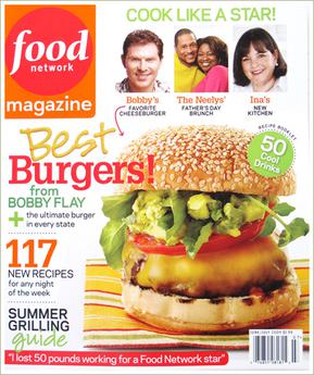

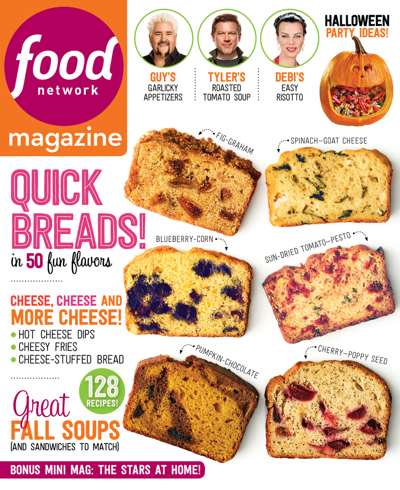
And yes, I understand the color psychology regarding food and appetite and to use reds and yellows, however, using bright, vibrant reds does not interest me at all because I feel like it is loud and obnoxious. Instead, I am going for more earthy, natural tones, rich in the deep colors of browns, reds, yellows, and greens. Now, I have to dive even deeper into my research to decide on my target audience and the stylistic elements that fits within my specific genre.
Until next time!
Thursday, March 10, 2016
The Battle of the Genres
Research, research, research... that is all that is on my mind right now. I am inspired by all of the unique, different magazine covers that I have been seeing all over the internet. I am really motivated to create something so original and intriguing, making my audience go "WOW!" but creating something extremely different is very hard to do when you have reoccurring ideas and themes in your head that you try not to copy. I believe that I will be able to create something so amazing, and I am so excited to see what it shall be. Through my research, I came across a very potent sentence that stuck out to me and made me focus on my task at hand even harder. It reads:

Some of the conventions for these two types of genres are very similar because they share a common target audience: woman around ages 25-50, mainly in the middle class. I also gathered that the content and the layout have similar patterns regarding the consistent formula each one does. The table of contents for each flows in the same manner for each issued magazine, creating familiarity for the target audience.
Alright, so in order for me to go full throttle into my project, I am going to have to make a decision on which elements I have more of a passion for.
Stay tuned!!
Citations:
Media texts. (n.d.). Retrieved March 10, 2016, from http://www.katpad.co.uk/media08/page2.html
MagazinePublisher.com. (n.d.). Retrieved March 10, 2016, from http://www.magazinepublisher.com/designtips.html
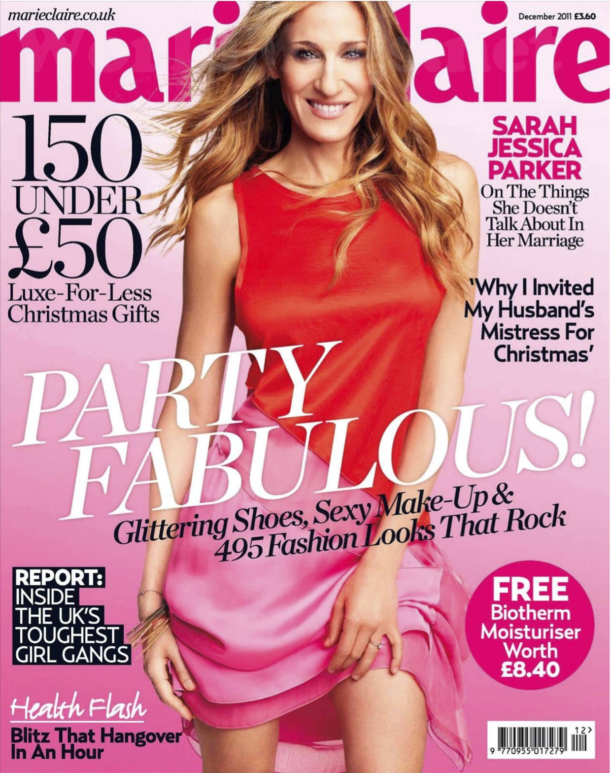
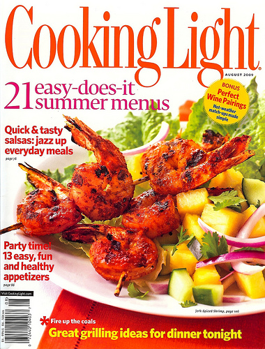
Magazine. (n.d.). Retrieved March 10, 2016, from http://www.cookinglight.com/magazine
Marie Claire Covers. (n.d.). Retrieved March 10, 2016, from http://www.soguemoments.com/2015/02/marie-claire-covers.html
"Remember, your magazine only gets one chance to make its first impression."After I saw this, it motivated me even more to make a statement for my magazine. The two genres I have in mind are food and cooking or woman's lifestyle. I enjoy reading both of these types of magazines genres, however, I was unsure of the specific characteristics of each genre and what makes them there own, until I did my research to help come to a decision. So, lets dive right into the surmised version of everything I gathered:
Food and Cooking: v.s. Woman's Lifestyle:
- Many high definition images -Cover image of a celebrity
- Use appetizing colors such as relating to feature article
reds, greens, yellows, whites - Use feminine, chic colors
- Promotional panel that features (pinks and reds with blacks
something for free, or a "bonus" and whites)
section (recipes/cookbooks) -Direct mode of address
- Flashy cover lines -Many styled fonts, often use
- Various bold fonts of handwriting font
- Large picture of a decadent dish -Content covers fashion,
with 2-3 text columns is a typical beauty, health and fitness,
layout for two-page spread love, and life
-Barcode displayed on cover -Barcode displayed on cover
Some of the conventions for these two types of genres are very similar because they share a common target audience: woman around ages 25-50, mainly in the middle class. I also gathered that the content and the layout have similar patterns regarding the consistent formula each one does. The table of contents for each flows in the same manner for each issued magazine, creating familiarity for the target audience.
Alright, so in order for me to go full throttle into my project, I am going to have to make a decision on which elements I have more of a passion for.
Stay tuned!!
Citations:
Media texts. (n.d.). Retrieved March 10, 2016, from http://www.katpad.co.uk/media08/page2.html
MagazinePublisher.com. (n.d.). Retrieved March 10, 2016, from http://www.magazinepublisher.com/designtips.html
Magazine. (n.d.). Retrieved March 10, 2016, from http://www.cookinglight.com/magazine
Marie Claire Covers. (n.d.). Retrieved March 10, 2016, from http://www.soguemoments.com/2015/02/marie-claire-covers.html
Subscribe to:
Posts (Atom)