"Remember, your magazine only gets one chance to make its first impression."After I saw this, it motivated me even more to make a statement for my magazine. The two genres I have in mind are food and cooking or woman's lifestyle. I enjoy reading both of these types of magazines genres, however, I was unsure of the specific characteristics of each genre and what makes them there own, until I did my research to help come to a decision. So, lets dive right into the surmised version of everything I gathered:
Food and Cooking: v.s. Woman's Lifestyle:
- Many high definition images -Cover image of a celebrity
- Use appetizing colors such as relating to feature article
reds, greens, yellows, whites - Use feminine, chic colors
- Promotional panel that features (pinks and reds with blacks
something for free, or a "bonus" and whites)
section (recipes/cookbooks) -Direct mode of address
- Flashy cover lines -Many styled fonts, often use
- Various bold fonts of handwriting font
- Large picture of a decadent dish -Content covers fashion,
with 2-3 text columns is a typical beauty, health and fitness,
layout for two-page spread love, and life
-Barcode displayed on cover -Barcode displayed on cover
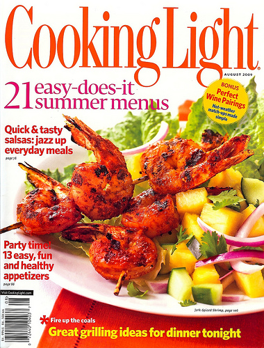
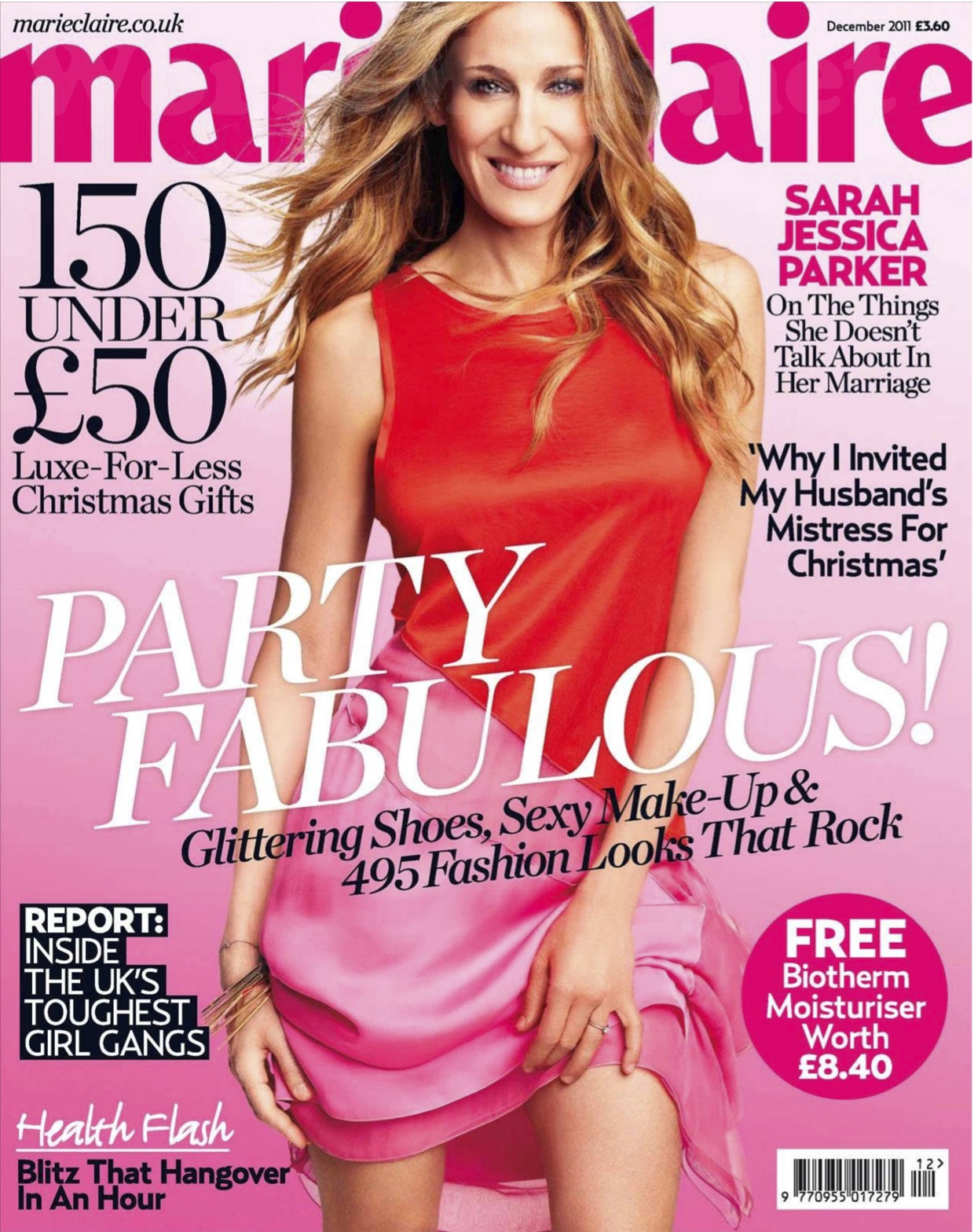
Some of the conventions for these two types of genres are very similar because they share a common target audience: woman around ages 25-50, mainly in the middle class. I also gathered that the content and the layout have similar patterns regarding the consistent formula each one does. The table of contents for each flows in the same manner for each issued magazine, creating familiarity for the target audience.
Alright, so in order for me to go full throttle into my project, I am going to have to make a decision on which elements I have more of a passion for.
Stay tuned!!
Citations:
Media texts. (n.d.). Retrieved March 10, 2016, from http://www.katpad.co.uk/media08/page2.html
MagazinePublisher.com. (n.d.). Retrieved March 10, 2016, from http://www.magazinepublisher.com/designtips.html
Magazine. (n.d.). Retrieved March 10, 2016, from http://www.cookinglight.com/magazine
Marie Claire Covers. (n.d.). Retrieved March 10, 2016, from http://www.soguemoments.com/2015/02/marie-claire-covers.html
No comments:
Post a Comment