Woohoo! I finally know what I shall title my magazine! After brainstorming savory food words, I came down to two options: indulgence and decadence. I wanted to capture the essence of my theme through my title, so what's better then blatantly telling my audience to take pleasure in eating rich, savory, flavorful food. I chose Decadence as my final title because I think it represents the luxurious, classy, and enjoyable food perfectly, rather than indulgence which, to me, makes it sound as if I want my audience to indulge in everything they ate, and that's not the case. I want them to "Feed the Soul" (which is what I made my selling line).

I worked on a rough sketch for my proposed vision for Decadence. I know now that I am definitely going to use a dark wood background for my cover page because it resembles more of my style and my magazine's style. I know I'm not the best drawer, so please don't judge my pasta dish. Anyways, I am really considering making my cover image a pasta dish with a fork twirling some of it around. I think this will add dimension to my cover page, while giving it an element of comfort. When my audience sees the dish ready to be eaten, they will know that this food is meant to eaten, not just to look at, and enjoyed with passion, appealing to their senses and appetite. The cover lines are simply just sketches; I may use what I wrote, I may add to them, or I may disregard them completely and create new ones. I don't know. I just wanted to give you viewers a chance to see a piece of my vision first hand.
I am choosing to use pasta for several reasons:
1. Because I like pasta,
2. Because my family has amazing pasta recipes,
3. Because it's easy to maneuver and plate for the photograph,
4. Because it maintains the level of elegance and class,
and 5. Because I am able to work around it to create any color scheme I want.
Now that I have a set image to go by and create digitally, I moved on to discovering what I would like to do with my table of contents. After looking at various options of how I can layout my table of contents, I am stuck on a set image in my mind that I want to recreate. And yes, I am very picky with all elements of my magazine because I know what I want and I'm going to do just that.
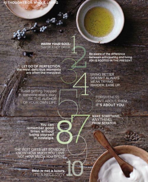
I want one image, displayed over two pages of table of contents, that is an aerial of either ingredients or food components. I prefer these pages to have a white background to contrast with my cover page and so it has open space, making my content seem shorter and easier to read, but many of the examples I found do not have all of these elements combined into one page. For instance, I want to incorporate many of the components of these examples into my page:


Even though all of these layouts appeal to me, I need to adjust them so they can fit the look and theme of my magazine. I still need to think about all of the logistics first, then I will get back to you all once I know what my imagination come up with next!
Adiós!
No comments:
Post a Comment